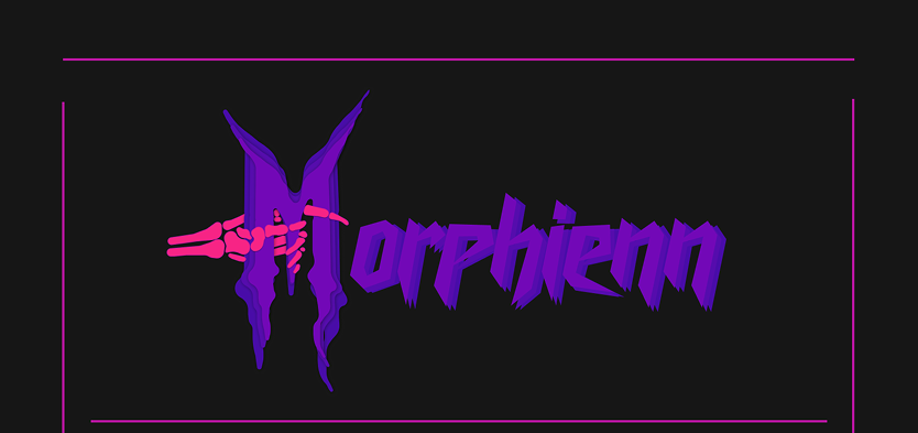
Branding

Logo Creation

Description

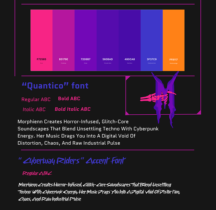
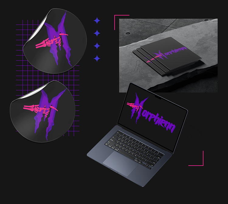
This group branding project was developed for a client, Dana, a student at the Rock Academy in Tilburg. As an artist, Dana produces mysterious and eerie music, often inspired by horror games and atmospheric background sounds, as well as some techno elements. Our task was to create a full brand identity for her, including a stylescape, brand guidelines, and a cohesive visual direction that reflects her cyberpunk, horror, and enigmatic aesthetic.
Goals and Objectives
My personal objectives for this project were to step outside my comfort zone, challenge myself creatively, and explore a design style completely different from my own. Additionally, I aimed to gain experience working with a client for the first time, improve my communication skills, and develop a stronger understanding of branding within the industry.
Target Audience
Dana’s target audience consists of individuals who embrace a dark, mysterious, and rock-inspired aesthetic. They are music enthusiasts, gamers, and people drawn to cyberpunk and horror elements. While Dana was the primary stakeholder, our branding decisions had to resonate with her audience while remaining true to her artistic identity.

Color and Font choices

Features

Our branding project included a brand guide and brand guidelines that Dana could use as a reference for future projects. Key elements included:Logo selection Font choices, Definition of her target audience, Establishing her tone of voice, values, and brand personality, Stylescape: A collection of photos, mockups, and content ideas that aligned with her brand identity, Brand guidelines: A structured document Dana could use to maintain brand consistency

Process and Methodology

We worked as a team, dividing tasks equally to ensure an efficient workflow. Each team member contributed logo and font ideas, and Dana ultimately selected my design. As a result, I took on the responsibility of developing the brand identity, refining the guidelines, and determining the overall layout, color scheme, fonts, logo, and mockups. My teammates handled additional aspects of the project, such as content creation and stylescape development.

Mockups

Challenges and Solutions

One of the biggest challenges was stepping out of my own design preferences and fully adapting to Dana’s cyberpunk-horror aesthetic. It was important to create something that aligned with her vision while also providing professional guidance. Additionally, ensuring that she was satisfied with our work while maintaining creative integrity required careful collaboration. To overcome these challenges, I focused on exploring and iterating various design choices, allowing myself to be bold and experimental. Open and respectful communication with Dana was key, ensuring that we could both exchange ideas honestly. This approach helped us refine the branding in a way that was both professional and authentic to her style.